Keynote
Design is a matter for the boss - even in medical technology
Why is a long-established manufacturer of life-sustaining medical systems cooperating with a creative company? The first part of the answer came last week in the form of one of the coveted IF Design Awards 2015 for the elisa 800 VIT intensive care ventilator at BMW Welt in Munich:

On the occasion of the "Night of Designers", our medical design team was once again able to celebrate a proud success. However, our innovative partner and customer Salvia Medical had much more fundamental reasons to challenge us than the awarding of the coveted international design trophy.
"There are good reasons to exchange ideas with a creative and results-oriented partner from the world of industrial design. Especially with life-sustaining systems such as our elisa 800 VIT intensive care ventilator, design, quality and functionality must form a closely interlinked symbiosis," explained Salvia CEO Christian Hartmann on the sidelines of the award ceremony. Almost all design elements have to meet medical, functional or hygienic requirements in order to survive in the tough everyday hospital environment. Based on the award ceremony and the feedback from our customers, we can say "Mission accomplished".
This casual statement was based on 30 months of intensive exchange at the customer interface and innovative design development for the new elisa 800 VIT.

What added value does design bring to a premium medical device?
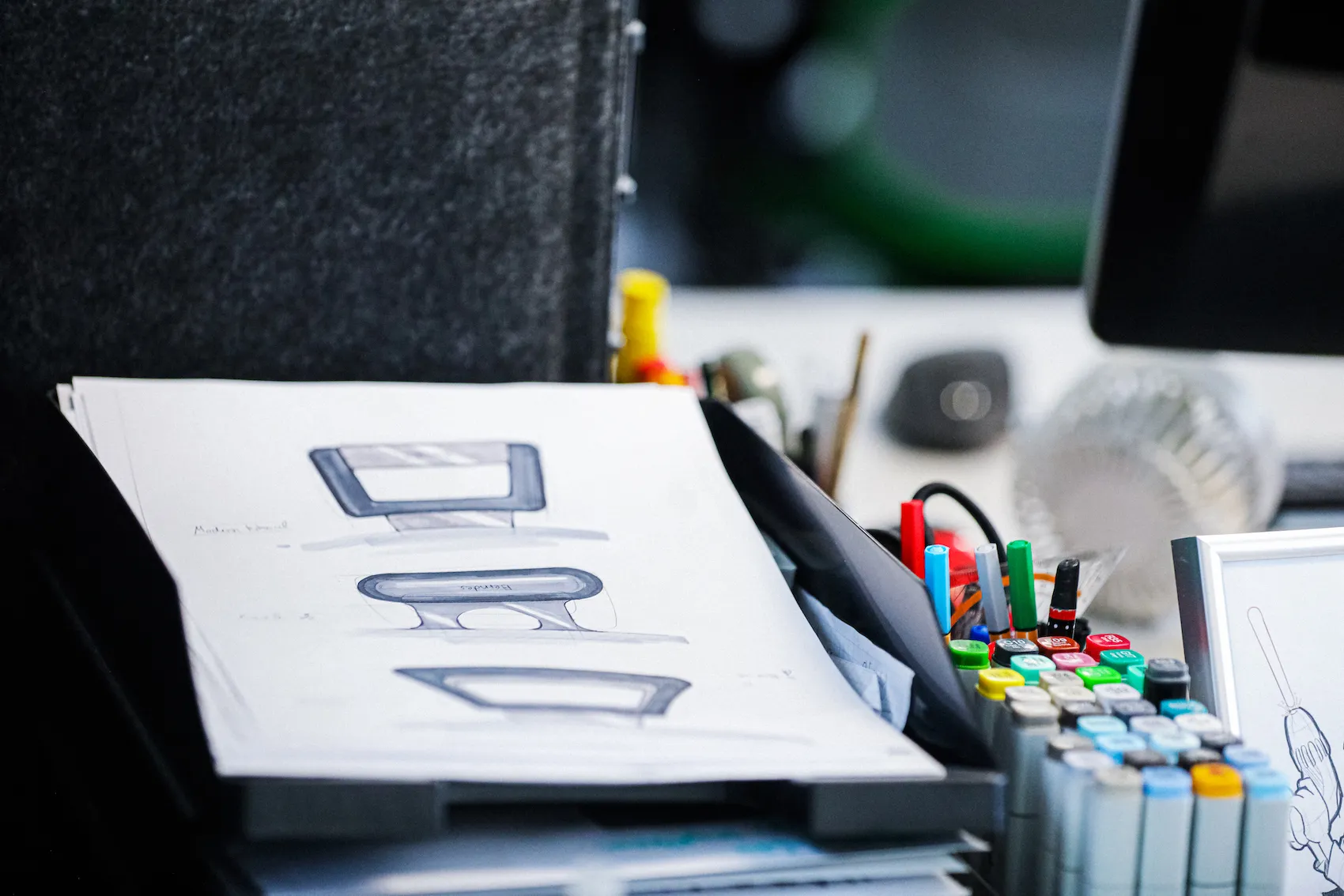
What started out as a simple redesign process resulted in a completely new approach that was able to significantly increase competitiveness in terms of usability, quality, premium appeal and design. The WILD team was initially asked to create a simple redesign of the existing Elisa device platform. We were happy to do this and considered a slight modernization combined with adjustments to the size, shape and appearance. However, the deeper we delved into the brief and discussions with engineers, designers, quality managers and medical professionals, the more we realized that the current and future requirements for a medical device required a complete rethink.
Particularly in stressful situations, aspects of self-explanatory operability, a coherent software structure and clear localization of components are decisive for successful treatment and the frequency of errors. Design is therefore not a question of appearance, but a global and multifunctional response to a modern workplace in intensive care medicine. Not least due to rapid medical progress and the frequent shortage of staff in hospitals, a wide range of questions must be asked and intelligent answers found in the course of design development.
My smartphone can do it too ...
And as the user research showed, the front panels used in medical technology, which had previously been predominantly equipped with mechanical buttons and controls, no longer met users' expectations at all - and not just for reasons of hygiene. Users simply could not imagine that a state-of-the-art medical device could not be operated just as smartly as they know it from their smartphone.
With this in mind, the redesign became a completely user-centered new concept. With the ambitious goal in mind of achieving a balancing act between the simplest, most intuitive operation possible and comprehensive growth paths for the realization of future functional expansions, the Salvia engineering team, with over 55 years of company know-how in clinical ventilation, and our design team started a second time.
Smart operation not only helps to avoid errors.
Our design approach went far beyond the device and technical excellence. This is because intensive care ventilators are integrated into a variety of work processes in everyday clinical practice and must therefore be able to be flexibly integrated into the hospital, moved from one room to another and should not take up an excessive amount of space.
With the ELISA console housing, which is now four decades old, a mobile base was simply added for this purpose, but this did not allow any integrated functions. So we started afresh and came to the conclusion in the usability analysis that the design of the trolley also makes a decisive contribution to getting closer to the patient with the device - a decisive advantage.
Future-oriented platform vs. proven design ...
Three sizes of ELISA had previously been tried and tested in use, all of which had a different design and required correspondingly coordinated peripherals. With the new trolley concept, we were able to integrate the different designs interchangeably on a uniform design platform. This saves costs and, above all, space in the hospital, as the different devices can be easily exchanged.
These innovations have excited the experts right from the start, ever since the device concept was first presented at the Medica 2013 world trade fair in Düsseldorf.
WILDDESIGN owner Markus Wild says: "The team was extremely flattered to receive the coveted IF Design Award for the elisa 800 VIT. It is not easy to win such an award when you consider that we were competing against 5000 other design teams from 53 countries worldwide. But even more important for us than winning this design award is the fact that, together with the developers of our customer Salvia Medical and our partner Swisstom, we have managed to meet the high expectations of users and set a new standard in the industry.
User-friendliness can sometimes be so simple.
One of the most important improvements to the new elisa was to reduce the tangle of tubes and cables and to reorganize the "workplace". In practice, it is the reorganization of the cables and tubes leading to the patient that allows the patient to be observed and enables the correct access to be found without losing time in an emergency.

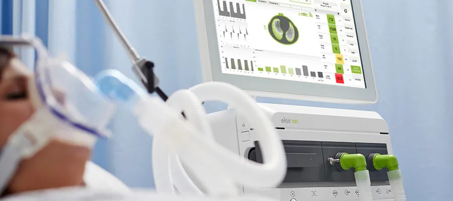
The reorganization of the necessary alarms and the information provided, some of which used to be unnecessarily hectic, has also been successfully implemented. The relevant alarms, information and measured values, which provide continuous information about the patient's condition, can now be clearly identified and assigned at any time via the 18.5-inch screen. However, the screen is not just a sophisticated display device, but also the control center for all vital settings. Everything becomes more transparent and directly controllable.
The world's first intensive care ventilator with a fully integrated EIT system provides a real-time image of the lungs and immediately shows the patient's condition and where interventions by the user are necessary. We call this innovation "Ventilator Integrated Tomography" = VIT. Salvia partner Swisstom developed the technology for this and was awarded its own IF Design Award for the design of the user interface. In other words: 2 (IF awards) in one go - chapeau!
Continuous improvement instead of a top-down approach
The entire design process took 30 months from kick-off to production-ready design and production. However, what made this project so good was not (only) the ingenuity of the developers, but the regular involvement of various experts and users, who ultimately provided many ideas for improvement. The new elisa 800 VIT is not just another technical device, but represents the next level of intensive care ventilation. For project manager Oliver Koszel, the elisa 800 VIT embodies a finely balanced relationship between aesthetics, ergonomics and technical expertise. Due to its orderly design, it is not only intuitive to operate and therefore much more accessible for the operating staff, but also appears clear and professional.
Initial spark for new branding
Our customer Salvia Medical liked the first design drafts for the new look of the elisa 800 VIT so much that they spontaneously recognized the scope of the good design. Parallel to product development, the WILDDESIGN team was entrusted with the redesign of the entire Salvia brand image. A new logo, a fresh color scheme, a new slogan "Breathing like Nature" - the reserved OEM manufacturer became a modern brand that confidently asserts itself in the industry. And all this on the side, so that not only a new ELISA could be presented, but a new Salvia Medical.
We think this is a great example of a consistent design strategy that has clearly not been created by a top-down general plan, but by continuous improvement and work at the grassroots level. Many thanks and congratulations to our customer Salvia Medical and the drivers of this development.
Frequently asked questions


