Perspective
Design revolution: creative change in MedTech (Part 2)
In our last article on non-invasive surgery, I presented the first stages of our collaboration with Rejoin, a newly founded Chinese medical start-up specializing in sports medicine implants and non-invasive arthroscopic instruments for surgery. Please read Part 1to learn more about the background.
With its extensive experience in medical design and a large number of projects for medical companies of various sizes, the WILDDESIGN Shanghai team was to support Rejoin in developing a consistent design language for arthroscopic instruments that are both functional and attractive.
Distinctiveness as a brand value
We began with a detailed analysis of existing competitor products. We clustered the hundreds of product examples on large positioning maps to visualize the portfolios and appearance of international and local competitors. By analyzing a range of factors from branding, marketing and product features, we found that the overwhelming majority of established competitors were stuck in traditional visual identities. Only a fraction of the entire global market had consciously adopted a dynamic visual identity.
From this initial snapshot, we could clearly see how Rejoin products could differentiate themselves from the market in the future by using shape and color as the main drivers.
Visionary from the start
Although he described it as quite daring, our client followed our bold and potentially risky suggestions to increase brand awareness. By convincing Rejoin to perceive their brand as dynamic and aligned with the big consumer brands mentioned in Part 1, we were able to take our ideas further. Now it may seem like we were moving backwards when we went for the retro-looking idea of "shocking purple-pink", but we were actually trying to establish a strong color to make it an integral part of the brand identity.
We wanted to avoid our customer not having enough courage to make such a decision at the end of the development process, as the topic of color in medical instruments is seen within narrow limits and preconceived ideas and cannot be compared with the topic of color in the consumer goods sector. It did indeed take some convincing, but that is also the beauty of design work: we can take the customer on a design journey through our visual representations. At this point, we turned our attention to the topic of user-friendliness and initially left the color without a Pantone definition.
Usability - the basic design principle
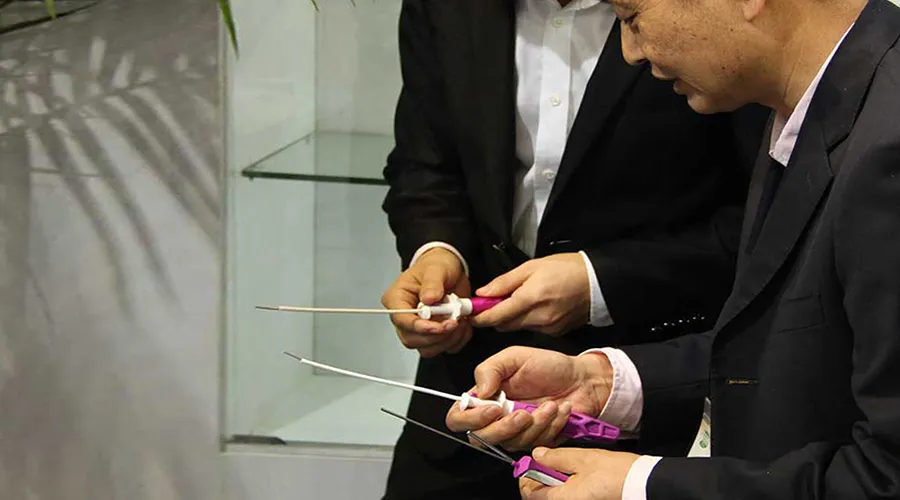
As a prerequisite to the design process, it was important to understand how each instrument would be used in clinical practice. As with my surgery, a variety of specialized shoulder tools were used to cut, drill, suture and screw. To meet these complex requirements, sports medicine has developed a series of standardized implants (anchors and sutures) that either remain permanently in the patient or biodegrade after about 5 years.
Polyetheretherketone, also known as PEEK, which is a colorless thermoplastic polymer, is the industry standard for such cases. The choice of PEEK over titanium stems from the potential risk to the joints; titanium components can cause abrasive problems and damage the inner capsule. Subsequently, we focused primarily on usability issues in the surgeon's palms and fingertips: ergonomic considerations for handles, interfaces or mechanisms that facilitated preparation and fixation of the implants.
Rapid prototypes - the lubricant for user-centricity
During the creative phase of our first tool, rapid iterative prototyping was used to manually test a number of different form factors directly. By the end, we had developed a handle geometry that tapered to a rounded pentagonal cross-section, ideal for surgical operations such as meniscus removal.
A few dozen 3D prints and hand models later, we had not only worked out the geometry but were also able to focus on the surfaces. It turned out to be a particular challenge to simulate the series surface in such a way that the texture in the injection-molded part would allow tests with and without disposable gloves. As "double gloves" are now standard to avoid surgical cross-infection, surgeons today demand ever better control over their tools and instruments.
Once we had established the shape of our first tool, we explored different ribbing techniques that would allow us to reduce material usage, increase tactility and ultimately create a unique design language stylistically. For this option, we optimized the handle structures to ensure they could be cleanly demolded as one injection molded part. Through dozens of foam and 3D printed prototypes, we defined the size and space of each opening and brought the final shape in line with the design and engineering requirements. We also created a quasi-algorithm for automatically deriving the ribbing to provide guidance for the rest of the tools. However, there was still a lack of user feedback to be sure.
Even more usability tests
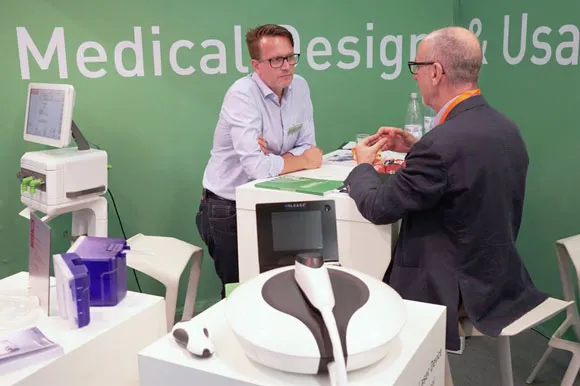
Now WILDDESIGN was nearing the end of the design concept and we had to face the reality of how well we understood the surgical procedures and the practical application. Surgeons and hospital staff came together in several workshops to test the developed prototypes. This provided an unbiased view of the actual use and perception of the users, which we documented via usability scores for various hand movements and interactions.
The ultimate goal of these tests can best be seen in Markus' last contribution: "to design surgical instruments in such a way that more efficient workflows, a higher level of safety for patients and less stress for users are possible". Inevitably, annoying details and potential handling problems were brought to the table, which were the subject of lively discussion and ultimately fed into the refinement and maturation of the product.
It's worth noting that connecting directly with surgeons and practitioners at the earliest possible stage is invaluable in validating initial product visions and concepts. By involving surgeons in these design and usability decisions and establishing a feedback loop, we have also sparked their interest in Rejoin, driving early success and awareness in the market. Since such usability testing more or less exposes all aspects, we were also able to generate input for the upcoming certification and sales issues, while at the same time demonstrating to us how to optimize product launches and ultimately create exciting brand experiences.
Color, material and finish
Back in the design studio, we worked more intensively with CMF (Color Material Finish). With the endless sea of conventionally designed products before us, we were increasingly confident that color would become an extremely important part of our design language. There was one last trick we hadn't thought of yet; how could the product become even more intuitive through material and color alone, while maintaining its eye-catching value? The answer was translucency.
Multiple refractions bring depth and saturation to the object, while the visible internal structure of the finished instrument conveys stability and confidence. From a purely aesthetic point of view, a purple translucent tool lying on a table with other "solid" tools would definitely stand out. Working with specialist suppliers of medical-grade plastics, we then began to select the ideal polymers and surfaces to realize this idea.
After a long testing phase of the polymer in injection molds and confirmation through CFDA certification, we had finally achieved our goal and created a highly attention-grabbing tool for this sports medicine segment. Supported by a strong Rejoin leadership team with a vision to make their brand the market leader and using a unique design language as an accelerator, we were then allowed to consistently apply these design features to all future tools to reinforce brand values and give confidence in a global vision.
In our next and final part III of this blog series we will share some of our latest developments for Rejoin and discuss the direct and indirect benefits of building a CIDM (Corporate Identity Design Manual). No matter what you call the overarching definition of a design language, Design DNA, CPP (Corporate Product Perception) or Design Guidelines, it enables great user experiences and creates external and internal identification with the brand, e.g. among employees. An important component of a progressive corporate culture. Stay on top of the topic. The future is not only non-invasive, but also translucent purple.
Do you already have questions?
Do you want to know more about why usability and color play a special role in medical design OR are you curious to learn more about the secret of design language - and how your company can benefit from it?
Talk to us and benefit from our trend knowledge.
Image sources:
[ Nike Uniform: https://news.nike.com/news/crimson-tide-to-play-for-bcs-title-in-nikes-most-innovative-uniform-system ]
[ Nike Golf Shoe: https://news.nike.com/news/nike-golf-launches-new-shoe-nike-fi-impact ]
[ Asus Zenfone: https://curved.de/news/asus-zenfone-2-deluxe-zoom-selfie-max-und-2-laser-im-hands-on-295370 ]
Frequently asked questions