Perspective
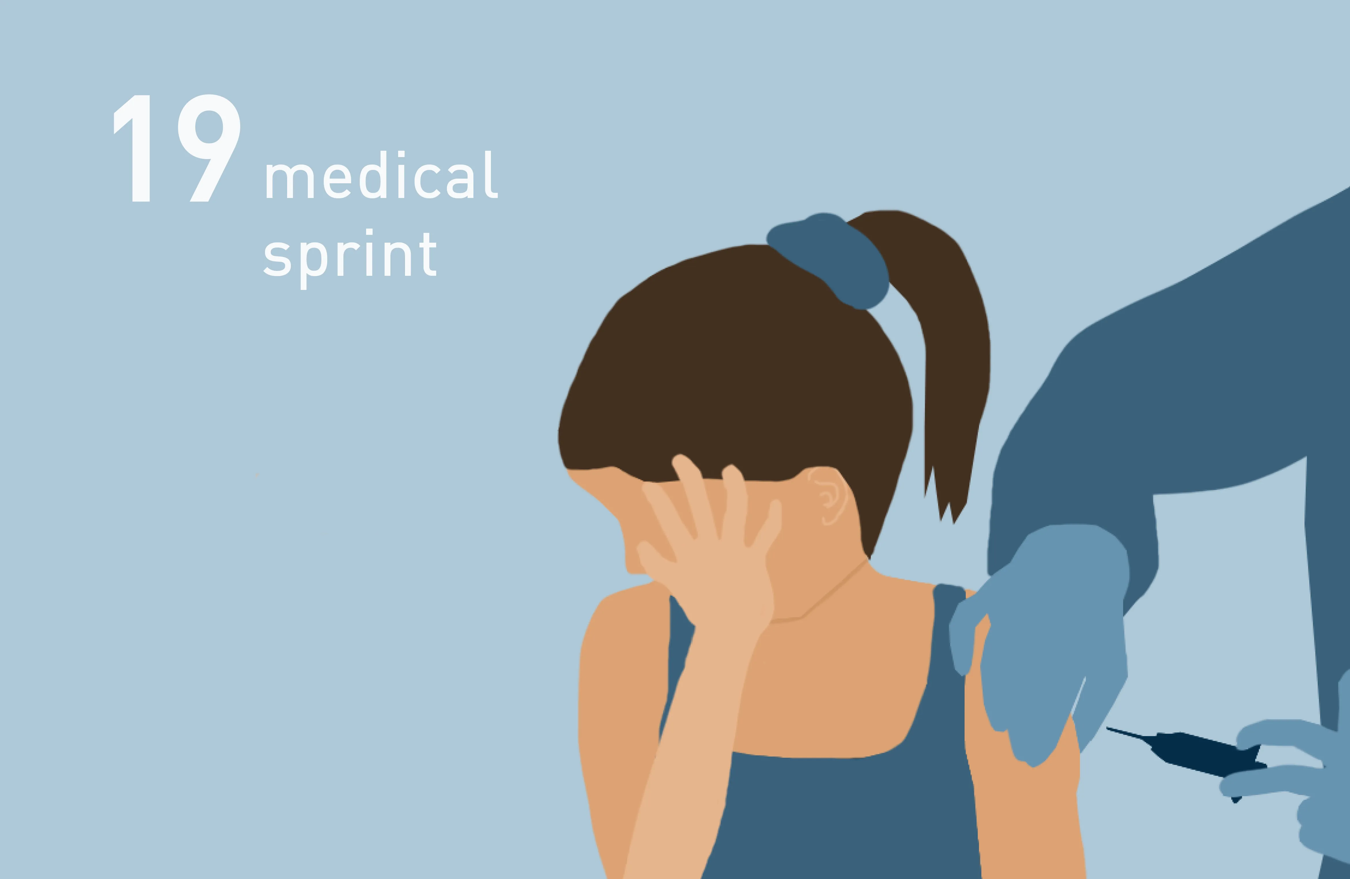
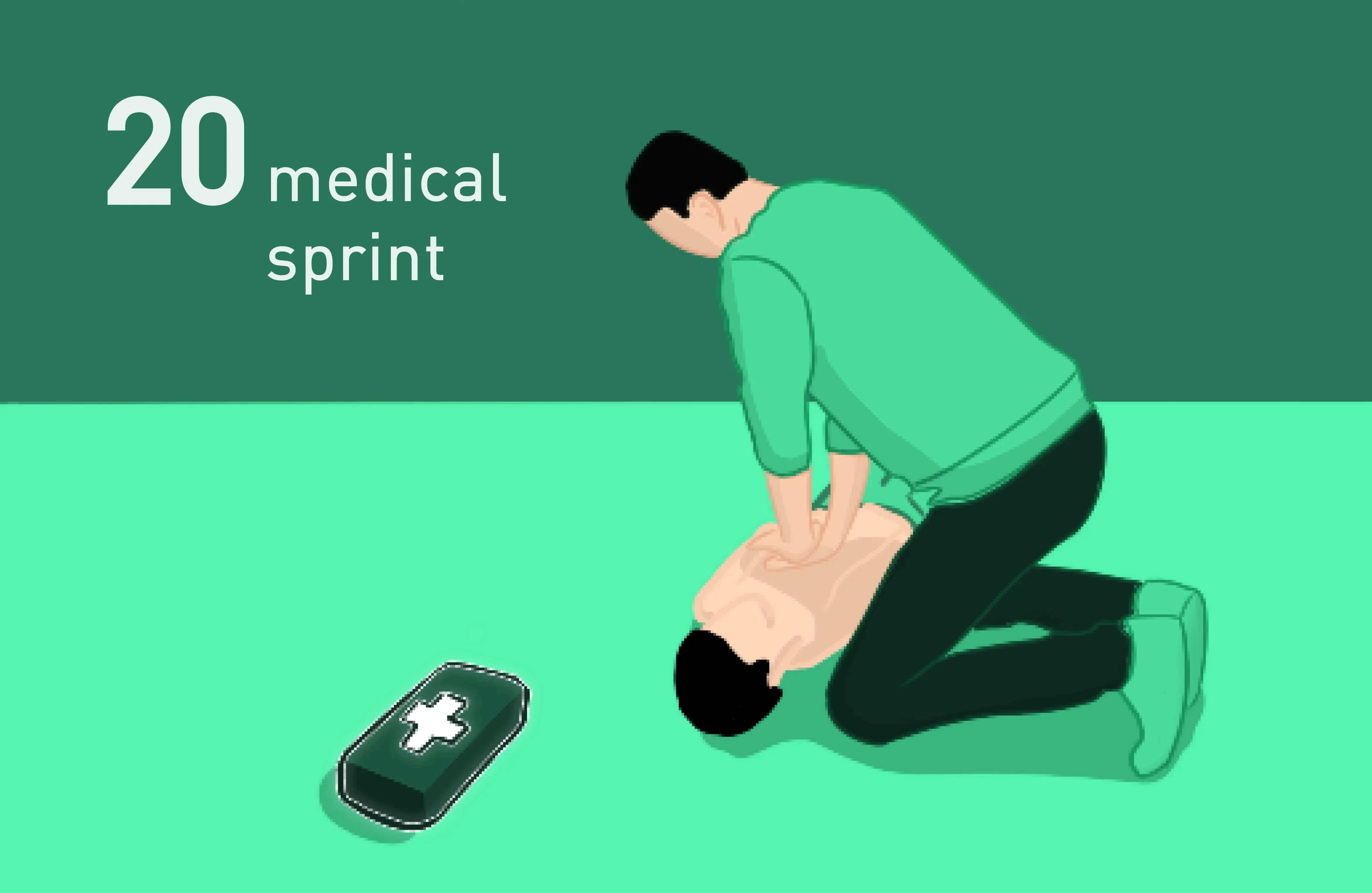
First Aid Kit - A different approach to first aid | Design Sprint 20
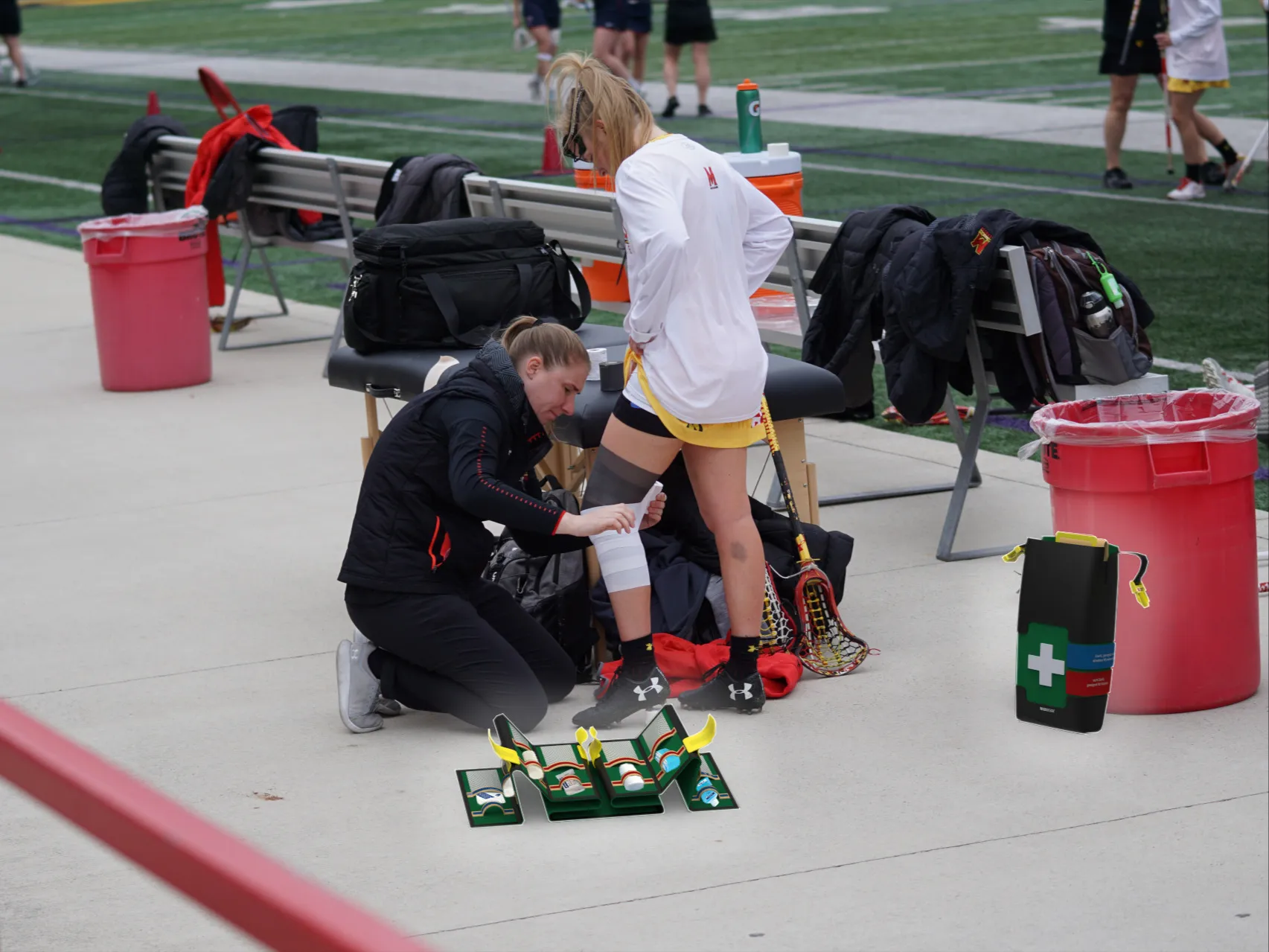
A training day on the sports field, suddenly a knee injury. The athlete falls to the ground, obviously in pain. Team members rush over and reach for the first aid kit. What they find: Chaos. Ice spray almost empty, bandages scattered around, important items within easy reach? Not a chance.
First Aid Kit - A different approach to first aid
How can medical design be created quickly, intuitively and reliably in an emergency?
Following on from this question, student Philipp Spiridi tried to rethink conventional first aid in his Medical Design Sprint in 2023, because injuries and accidents can happen anywhere, from hiking trips to everyday office life. Quick action and good instructions are often decisive for the further course of the injured person's health until the emergency doctor arrives.
Unfortunately, conventional first aid kits are often overfilled and very confusing. This is where the First Aid Kit from this design sprint should help.
With the help of various features, the reading and use case of the individual products in the bag should be clearly defined and thematically structured.
The details
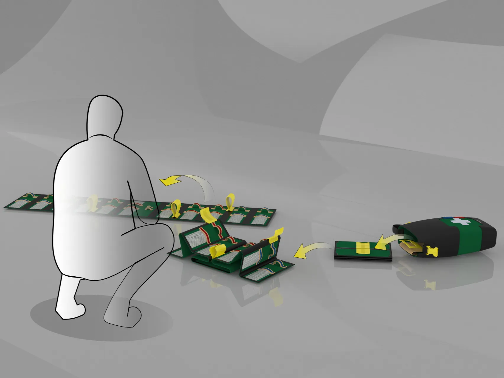
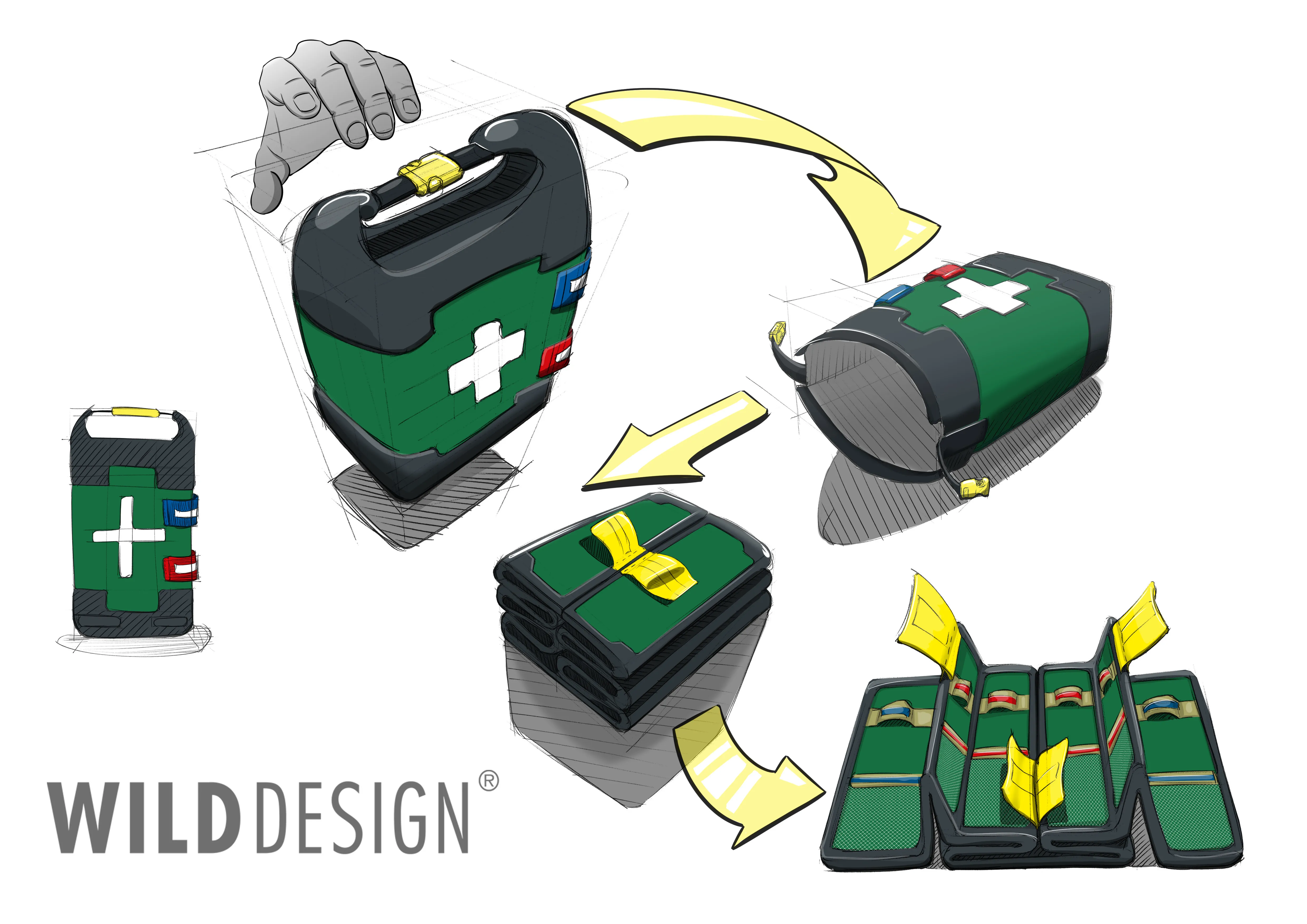
The innovative first aid bag was specially developed to ensure fast and effective first aid measures in emergencies. This is why the two-part bag is made of high-quality and robust material.
The sleeve guarantees that the bag is both waterproof and dustproof to protect the contents. Furthermore, it has a label on the outside for the color system of the inner pocket, which will be explained in more detail later on. Another important feature is the integrated tongue, which enables the inner bag to be removed quickly.
The inner pocket is structured in layers and offers space for various medical equipment and consumables. The loops and mesh pockets are color-coded to enable quick identification and removal of the operating materials. The color blue stands for all materials that are sterile and therefore suitable for direct wound contact; the color red indicates consumables that are more suitable for fixation and support. The inner pocket also has large yellow tabs for handling the layers.
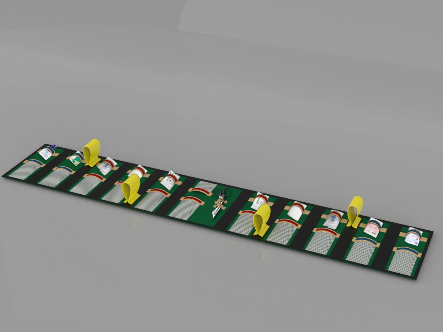
The design deliberately complies with current DIN standards and therefore offers the possibility of DIN certification. Furthermore, interactive elements were deliberately kept in signal yellow to ensure reliable handling even in poor lighting conditions. The other relevant colors were also deliberately kept medical, with blue and red.
Thanks for your design sprint, Philipp.
Frequently asked questions