Timeline
2010 | Tony's Farm - repositioning of the Eco brand
March 2010 | Case study on the collaboration with the successful Shanghai start-up Tony's Farm in the areas of brand, product and strategy.
Tony's Farm - Sustainable agriculture in China
Packaging design & web design for a Chinese organic farm
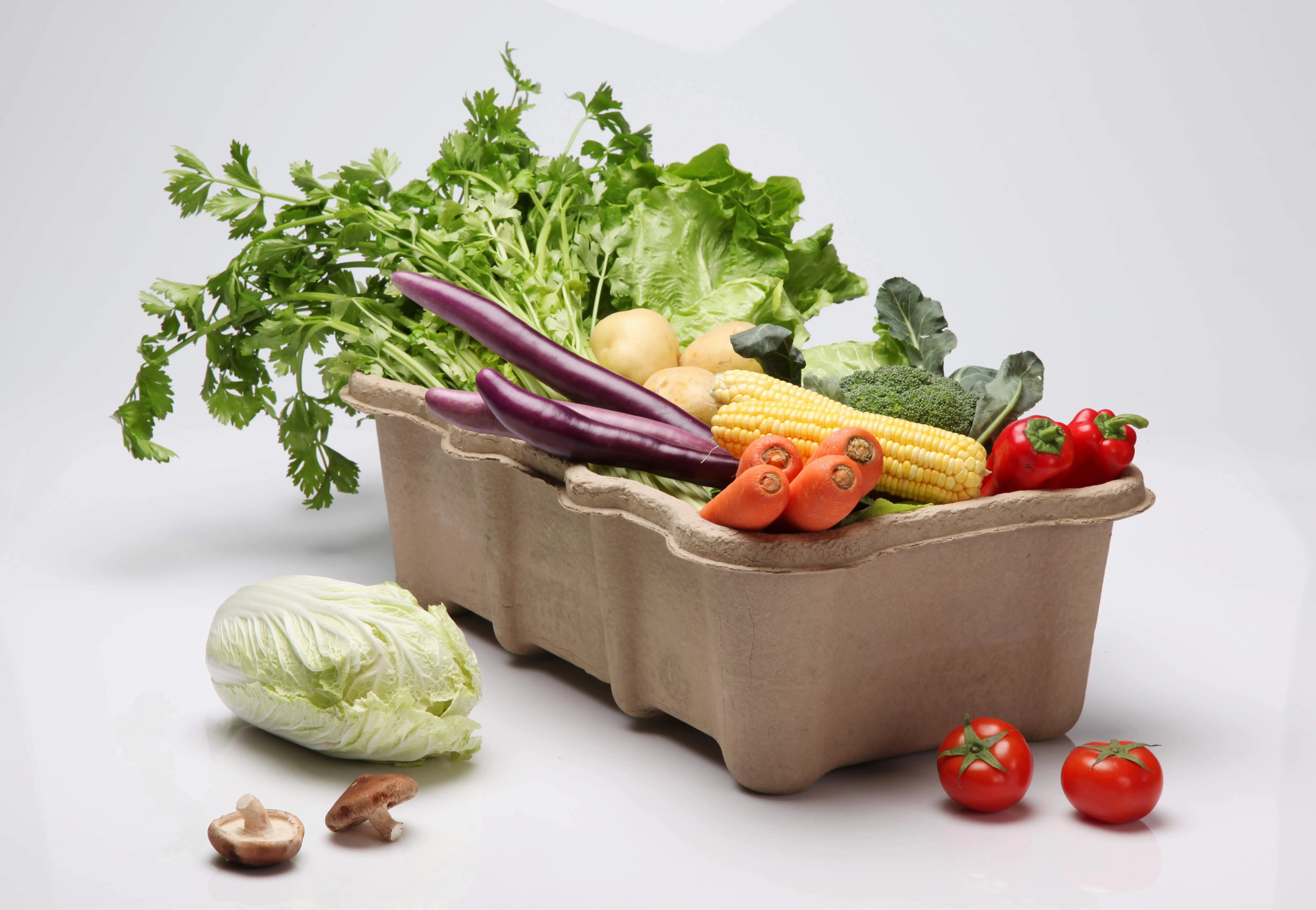
Tony's Farm wanted to develop a new packaging design for its transport box in order to communicate its ecological conscience more effectively in its daily dealings with its customers and members. This was to be filled with up to 6 kg of fresh vegetables and delivered to customers. The box needed to be stackable and able to carry the weight of up to 3 additional boxes.
Design process
Afterasking Tonys Farm customers about their needs, the entire internal production process from harvesting to packaging, transportation and delivery was examined and far-reaching potential for improvement was identified. At the end of the project, WILDDESIGN redefined the positioning of the brand and developed a user-friendly website that leads to the goal with fewer clicks.
Design result
TheCO2 emissions of the new Eco Box due to logging and transportation weight are significantly lower than those of the previous wooden box. The new Eco Box therefore meets the requirements of customers and employees alike and underlines Tony's Farm's commitment to the environment.
What was the WILDDESIGN part?
- Innovative packaging design
- Examination of all operational processes for a strategic service design
- Print materials to support the service process
- Visitor-friendly web design
- Reduction of CO2 emissions
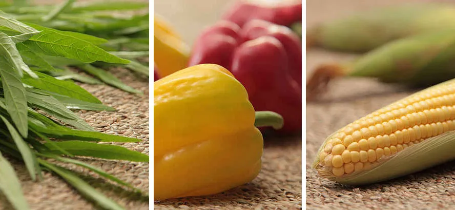
Bilingual website
Project task
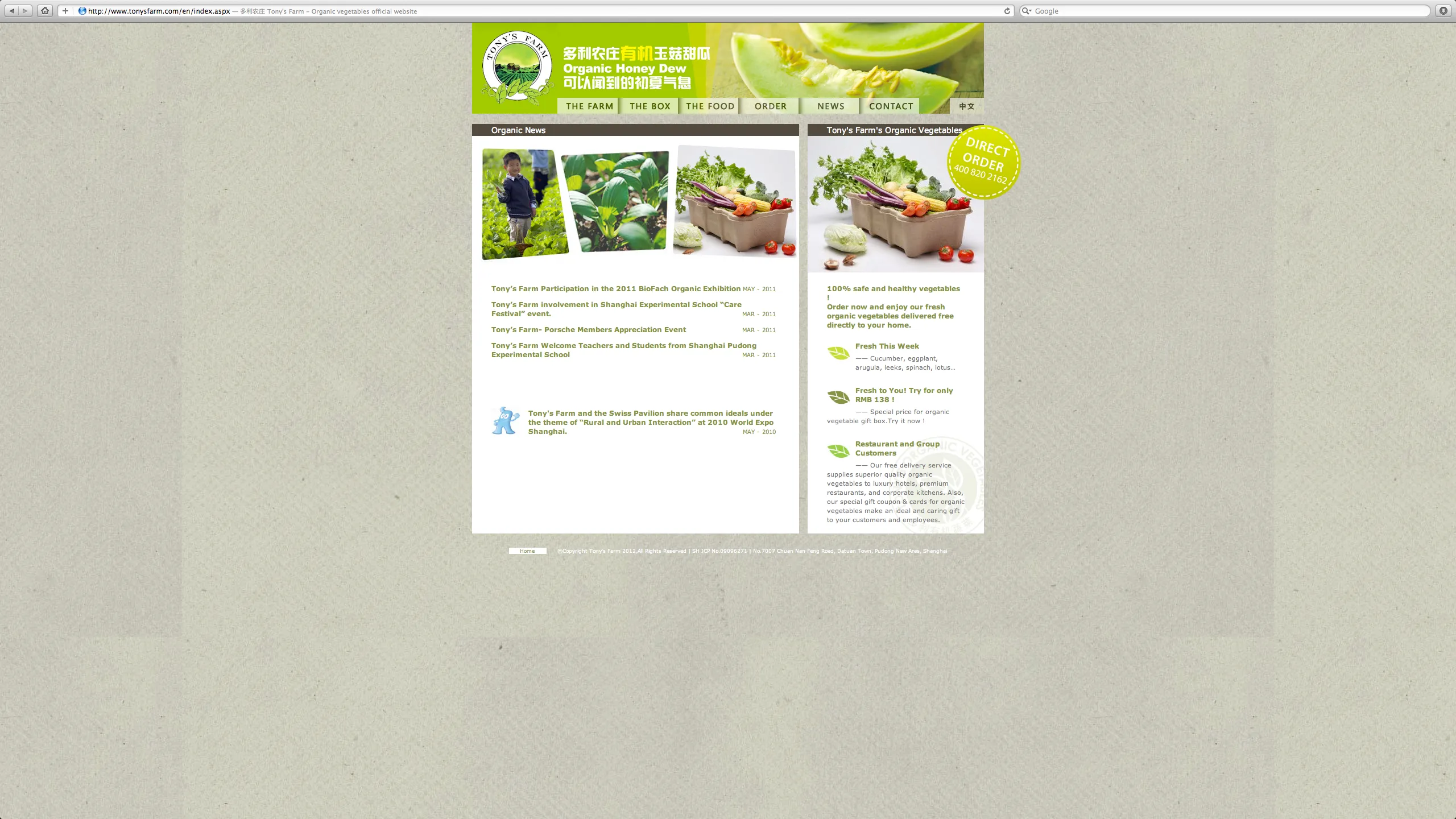
Credibilityand transparency were the most important communication goals for Tony's Farm. The previous website was too playful and offered too little information. In addition, each order required a cumbersome telephone process.
Design process
Ourfirst starting point was the information content: what do customers want to know from their vegetable supplier and how can we present the seriousness of Tony's Farm and its organic farming principles? We developed an information system to match the seasonal offerings to educate customers about the value of a wholesome organic diet and offered weekly recipe suggestions that could be recreated using Tony's Farm produce.
Design result
The website is now an important sales tool for Tony's Farm and gives customers and potential customers a comprehensive overview of the vegetable range. There is also an easy-to-use ordering interface, which is now used to process most orders. After just one year, the number of customers has increased from 200 to almost 6,000 "subscribers".
What was the WILDDESIGN part?
- Bilingual website
- Photo direction
Frequently asked questions


