Timeline
2015 | SAALMANN - A traditional brand reinvents itself
February 2015 | Case study on a redesign of the product portfolio and development of a new corporate design for a long-established medical technology company.
Integrated design of product and brand

Project task
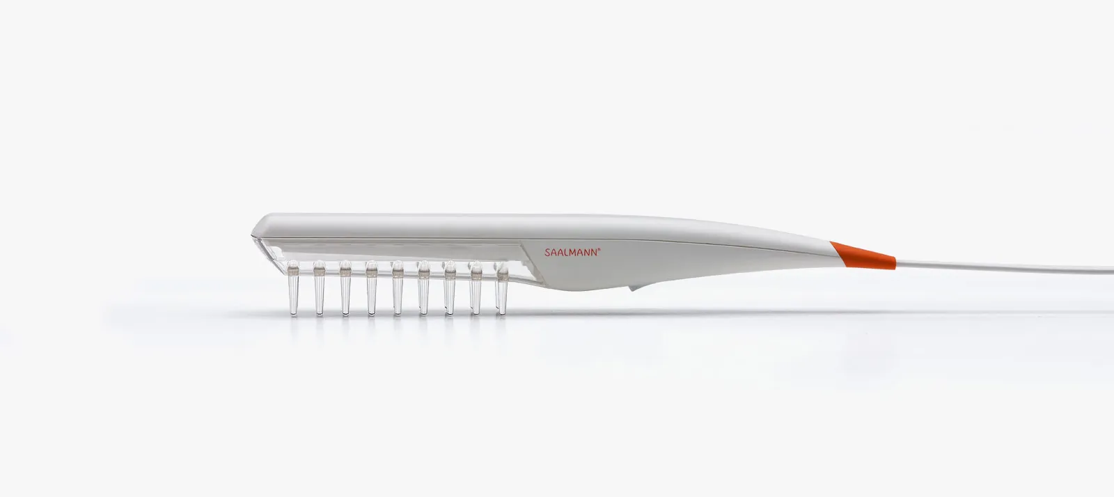
Itis not too often that a design agency has the opportunity to accompany the rebirth of a traditional, globally renowned brand. And not just in corporate design, but in an integrated process with the development of the first two products in the new product portfolio with which Saalmann medical GmbH & Co. KG has been back on the market since spring 2015.
The traditional Saalmann® brand has stood for pioneering spirit, product innovation and patient well-being in the field of dermatological diseases in medical technology for many decades. The brand was named after and created by Gerhard Saalmann - one of the pioneers of UV phototherapy, who still supports the company today as an experienced consultant. Due to his own psoriasis, he recognized the need for an effective treatment method very early on and developed his selective UV phototherapy (SUP®).
In addition to the actual illness, skin conditions often cause additional restrictions in social, professional and private life for those affected. That is why the Saalmann motto is: Understand the application and see the person. This was our starting point for the redesign of the brand and products.
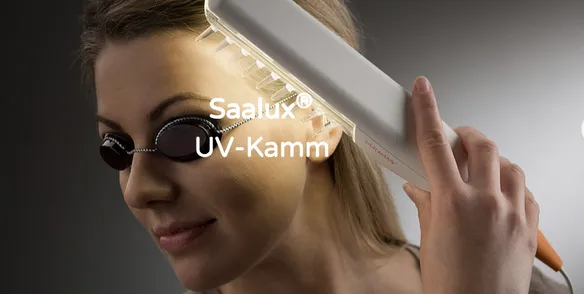
Product design for home use
SAALUX®, the new hair comb for effective psoriasis treatment, has been consistently designed for daily use in the home environment. The similarity to other hair care appliances such as hair dryers or curling irons is intended to prevent the application from having a stigmatizing effect. At the same time, the design is intended to make it easy and clear for the customer to use and quick to clean.
The basic shape was derived from ergonomic models. Before the final design, two design directions were discussed with our customer. The design result was implemented in a 3D CAD model and refined with a view to series production.
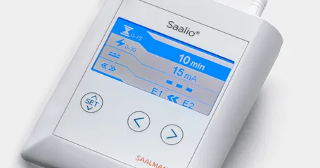
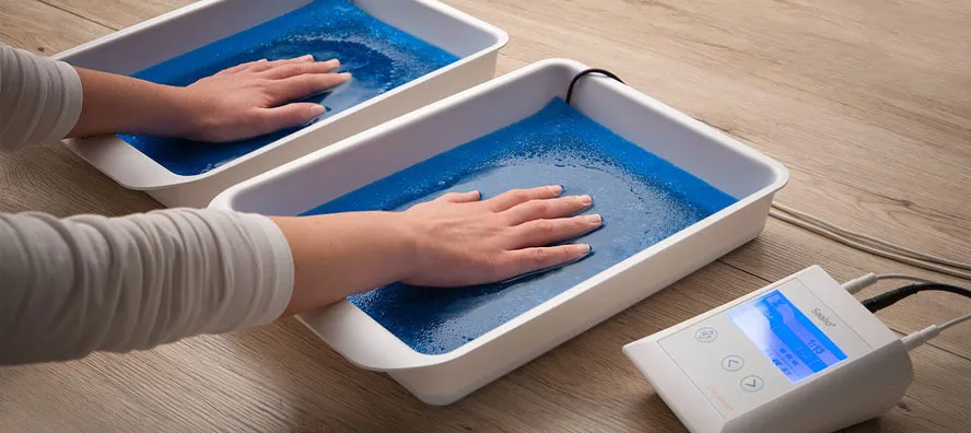
The GUI (graphical user interface) of Saalmann's SAALIO® iontopheresis device was redesigned at the same time as the new product design of the hair comb. Here, too, the aim was to improve the user-friendliness of the device and to make the voluminous application trays more professional.
We examined various user scenarios and processed the findings in two different design concepts, which arranged the most important information and operating points in a clearly understandable way.
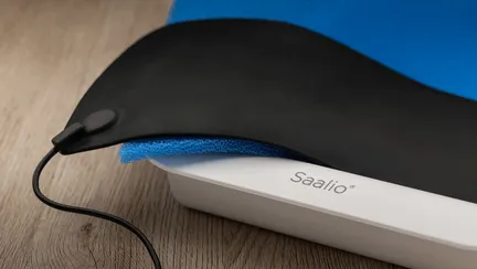
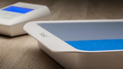
Brand development process
TheSaalmann brand is not a newcomer, but an established company with decades of experience. In the first phase of the brand relaunch, we therefore first worked out the previous brand history and analyzed the role of the Saalmann brand in the competition. With the insights gained, we developed the image of an understanding, competent brand that puts people at the center of its work.
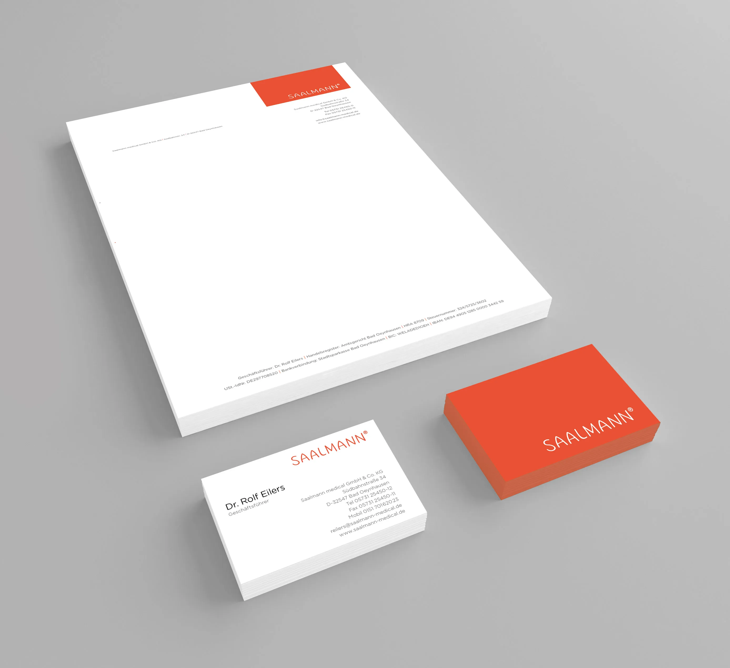
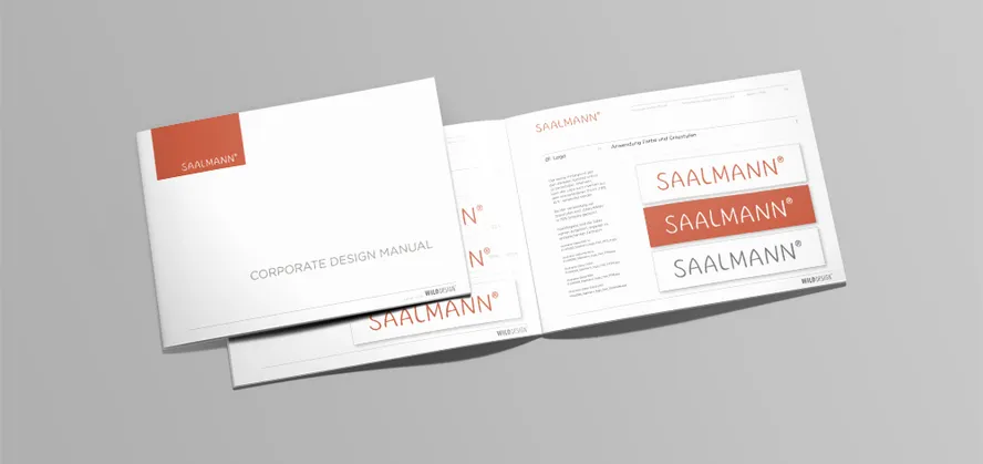
Based on this idea, we developed a self-confident, friendly brand concept, on the basis of which a new corporate design was developed. This was then implemented on letterhead, business cards and brochure layouts and defined with a small corporate design manual for future development.
What was the WILDDESIGN part?
- Ergonomics
- Product Design
- 3D modeling
- GUI design
- Color design
- Corporate Design
- Design guidelines
Frequently asked questions

