Timeline
2013 | Trilos - Brand and product for capital goods
TRILOS CAPITAL GOODS DESIGN
PROJECT TASK
March2013 | The newly founded company Trilos is all about three-roll mills. We had the exciting task of developing the brand and product identity for Trilos. Our client's aim was to gain a foothold in the global market. To appeal to new customers, WILDDESIGN therefore developed a concept for this highly integrated machine that also makes a strong visual impression.
360° BRAND AND PRODUCT DESIGN
WILDDESIGN's 360° approach initially focused on the branding of the newly founded company. We analyzed the core values and requirements to create a corporate image that tells a story but at the same time is focused on the future. Thanks to our competitive analysis, we were also able to identify advantages that showed our client potential market niches.
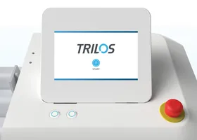
We drew up a list of possible names for the new brand that evoke strong feelings and all revolve around the theme of "three". This is how the brand name Trilos came about. After creating the brand story, we continued seamlessly with the concept development for the product and the brand identity. We wanted to create a product that stands out due to its external appearance and reflects the values of the young company. The chosen values "Refined" and "Bespoke" stand for the precision, user-oriented operation and customized design of Trilos' three-roll mills.
TRILOS PRODUCT DESIGN
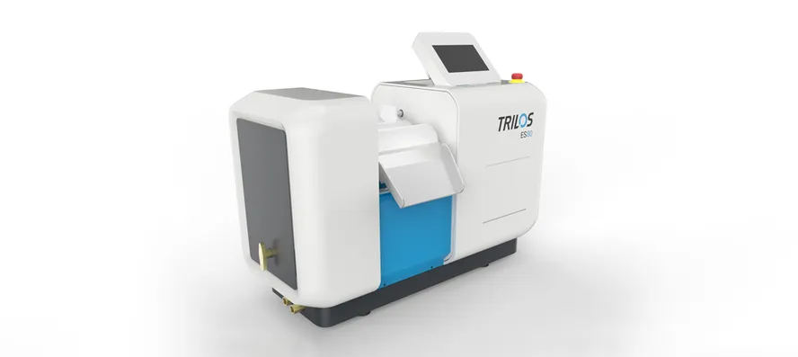
THE NEW TRILOS PRODUCT DESIGN
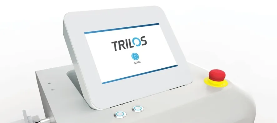
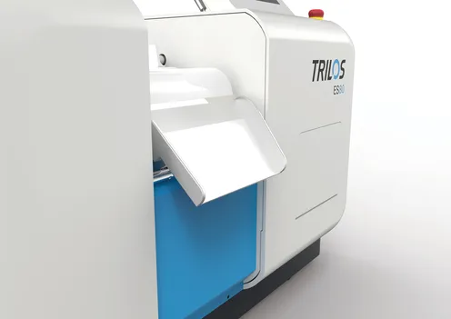
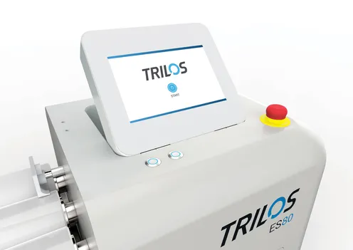
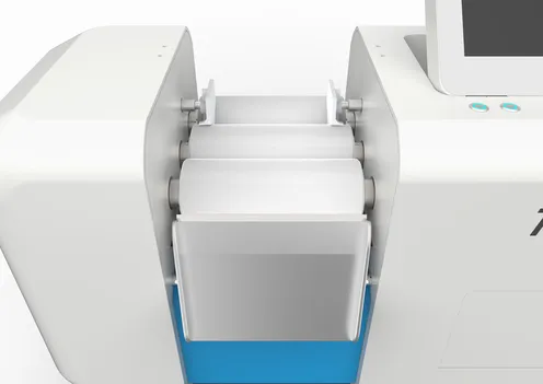
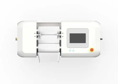
Inthe product design was primarily about creating a clear and uncluttered overall impression. Here we chose a new approach that clearly sets it apart from the competition. What sets the Trilos three-roll mills apart from other products on the market is the smart and fully customizable user interface. user interface. We focused on making difficult and complex functions easy to understand in an integrated and electronically controlled touchscreen, which is not available from any other supplier in this form. The rounded corners and the rectangular screen create an interesting contrast. The blue splashes of color make the design stand out and add variety. It looks elegant and professional.
TRILOS BRANDING
THE NEW TRILOS BRAND
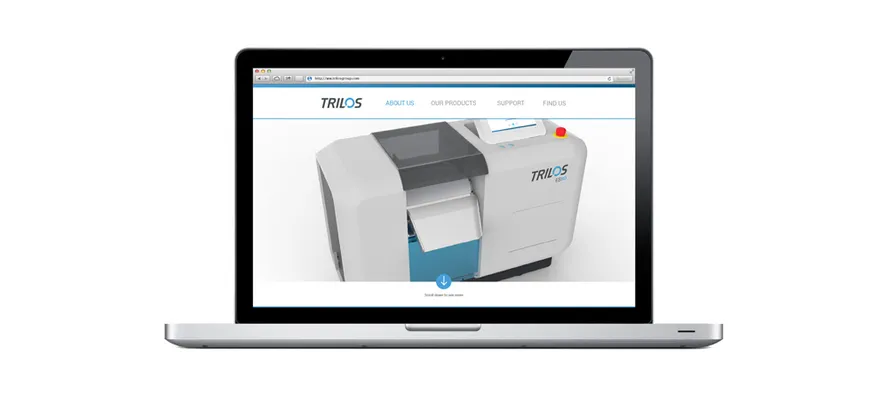
The new brand conveys a contemporary, elegant and clear image. The logo developed by our graphic designers is characterized by a simple and modest design. On the one hand, the logo should have clear demarcations, but on the other hand it should also convey a light, airy impression. The implied movement in the logo emphasizes the dynamism. This logo was then applied to all business units to create an eye-catching brand identity that stands for an open design and an elegant appearance.
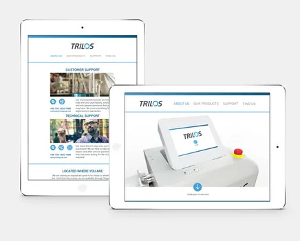
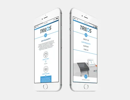
This brand identity was also implemented in the design of the website, which enables easy access to all platforms. The one-page website enables fast scrolling and easy retrieval of content. Users should be able to view each product at their leisure without being inundated with irrelevant information.
WHAT WAS THE WILDDESIGN PART?
- 360˚
- Design concept
- Design development
- Design prototype
- Brand development
- Corporate Identity
- Corporate Communications
- Web design
Frequently asked questions

