Surgical Robot Startup
The future of surgery: robotics and UI design
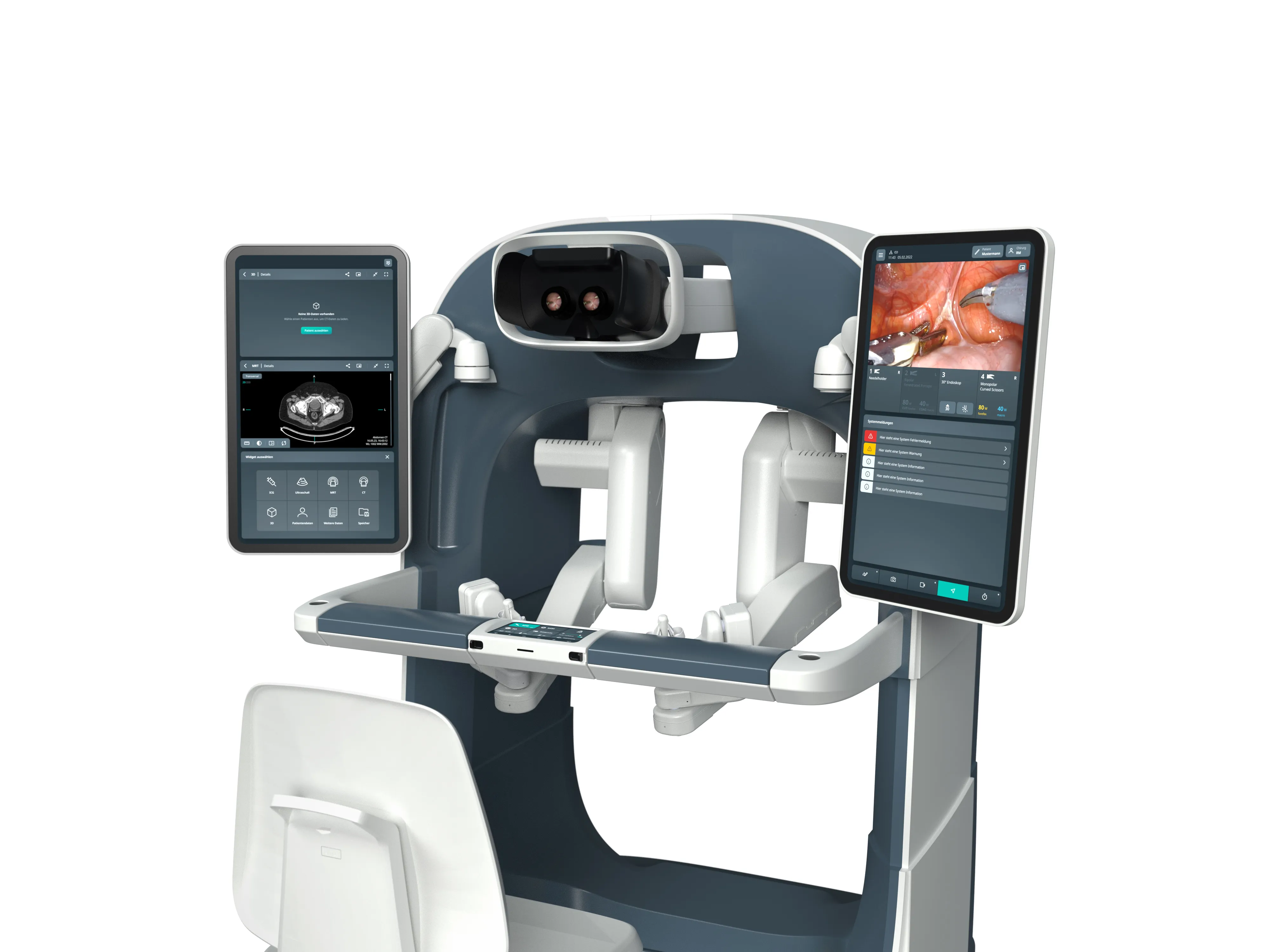
This is part 2 of our two-part series about working with an ambitious start-up in the world of robotic surgery. In this part, we look at the development of the user-friendly interface (UI) for the surgical robot.
Imagine you are sitting in the cockpit of a state-of-the-art jet. Everything is clear, well-organized and intuitive to control. This is how we envisioned the user experience for surgeons working with a robotic assistance system. The telemanipulator, which enables interventions with millimetre precision, should be supplemented by an intuitive, ergonomic interface that facilitates work in the operating room. This was our goal - even if it did not come to a final implementation.
Task
- Develop a user-friendly user interface
- Cost-effective robot-assisted minimally invasive surgery
- Optimize communication channels in the OR team
- Customizable interface design
- Improving ergonomics in the OR
Procedure
- Work shadowing during robot-assisted operations
- Analyze user needs through interviews and feedback
- Perform workflow analysis
- Designing and developing prototypes
- Conduct usability tests and adapt the interface iteratively
Result
- Intuitive multiscreen user interface
- Graphical user interface for different user groups
- More efficient and safer work processes
- Improved communication and coordination in the OR
- Optimized ergonomics and reduced stress for the surgical team
Robot-assisted surgery for all
The aim of this project was to make minimally invasive robotic surgery more accessible. A cost-effective telemanipulator should make it possible to reach a larger number of patients, especially in less developed healthcare systems. The technological innovation would have theoretically enabled surgeries via internet-based remote access, improving access to high-quality surgical procedures worldwide. The telemanipulator was intended to simplify complex procedures and increase precision to enable qualified surgical treatments even in remote regions.
Tailor-made user experience: customization made easy
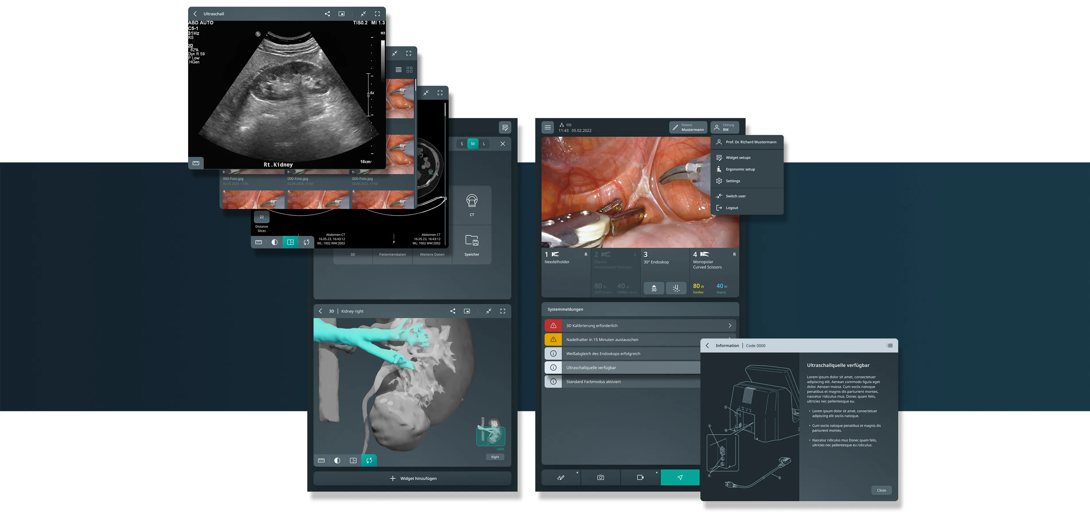
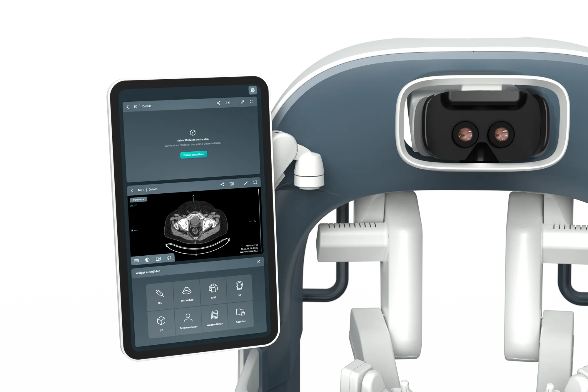
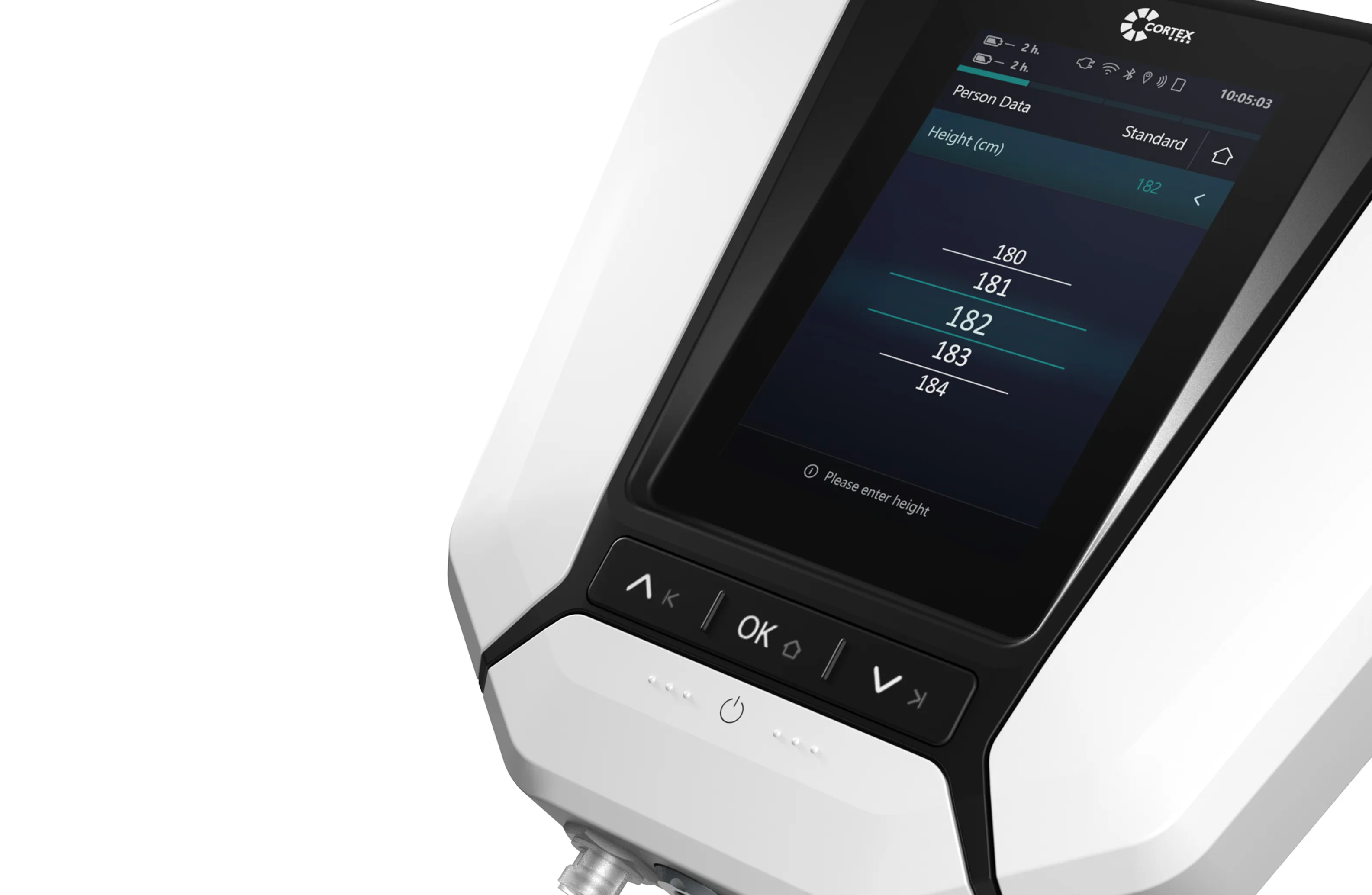
The interface was designed to allow surgeons to configure it according to their individual needs. Widgets and functions could be customized, which should enable flexible and efficient use. Clear feedback and intuitive menus were designed to ensure smooth collaboration between surgeon and surgical team. The surgeon receives precise feedback and control information, while the surgical team receives clear, process-related instructions. Clear icons, logical menus and visual cues ensure quick access to all necessary functions and smooth collaboration within the surgical team.
Better working conditions during long operations
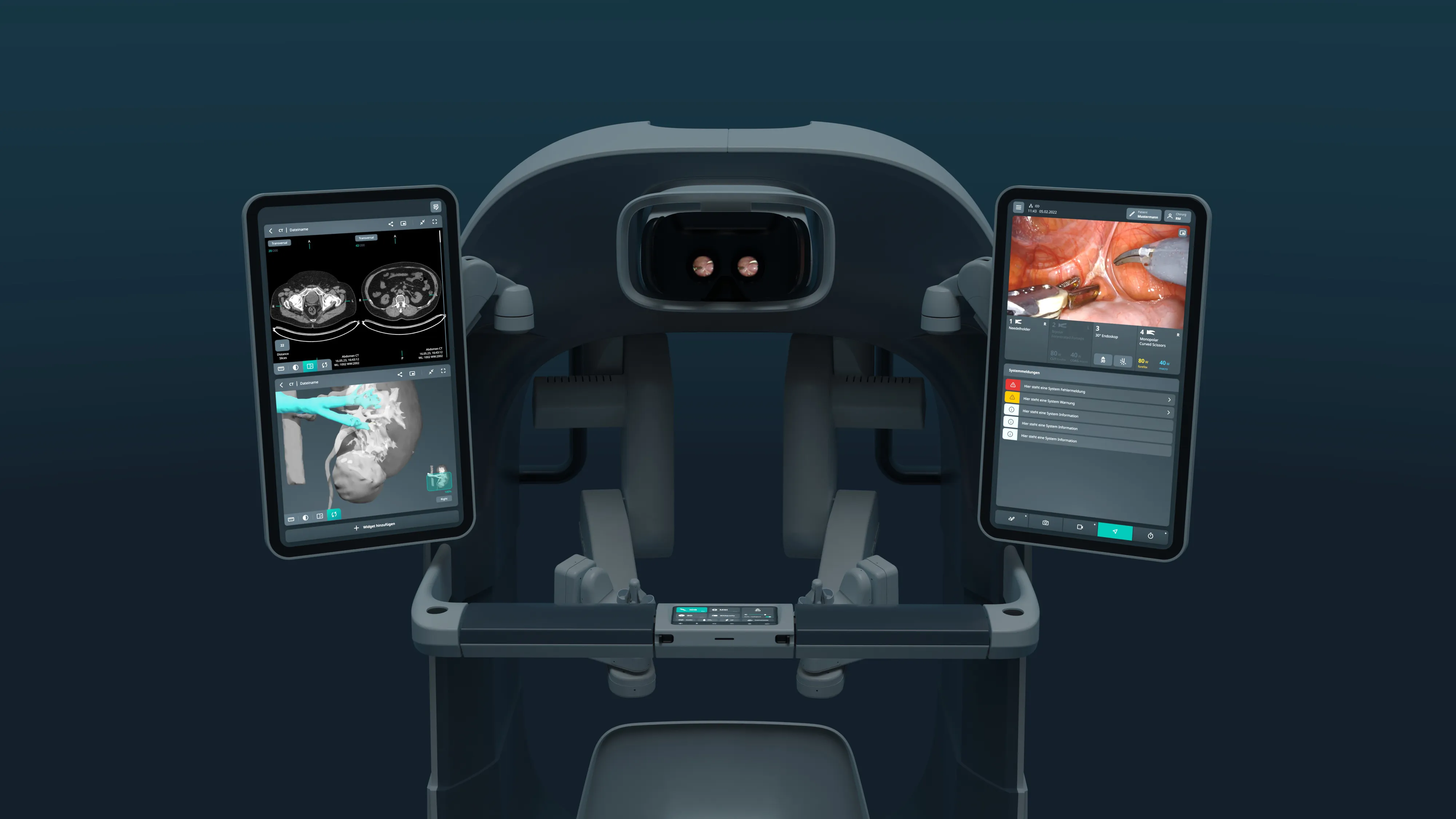
A key aspect of the design was to improve ergonomics for surgeons. The sitting workstation of the control unit was designed to withstand long operations and reduce the physical and mental strain on surgeons. Regular user tests and feedback loops confirmed the high ergonomic standards. Working conditions were significantly improved, resulting in increased efficiency and surgeon satisfaction. These ergonomic improvements contributed to surgeons being able to work with concentration and precision for long periods of time.
Reduce complexity as much as possible
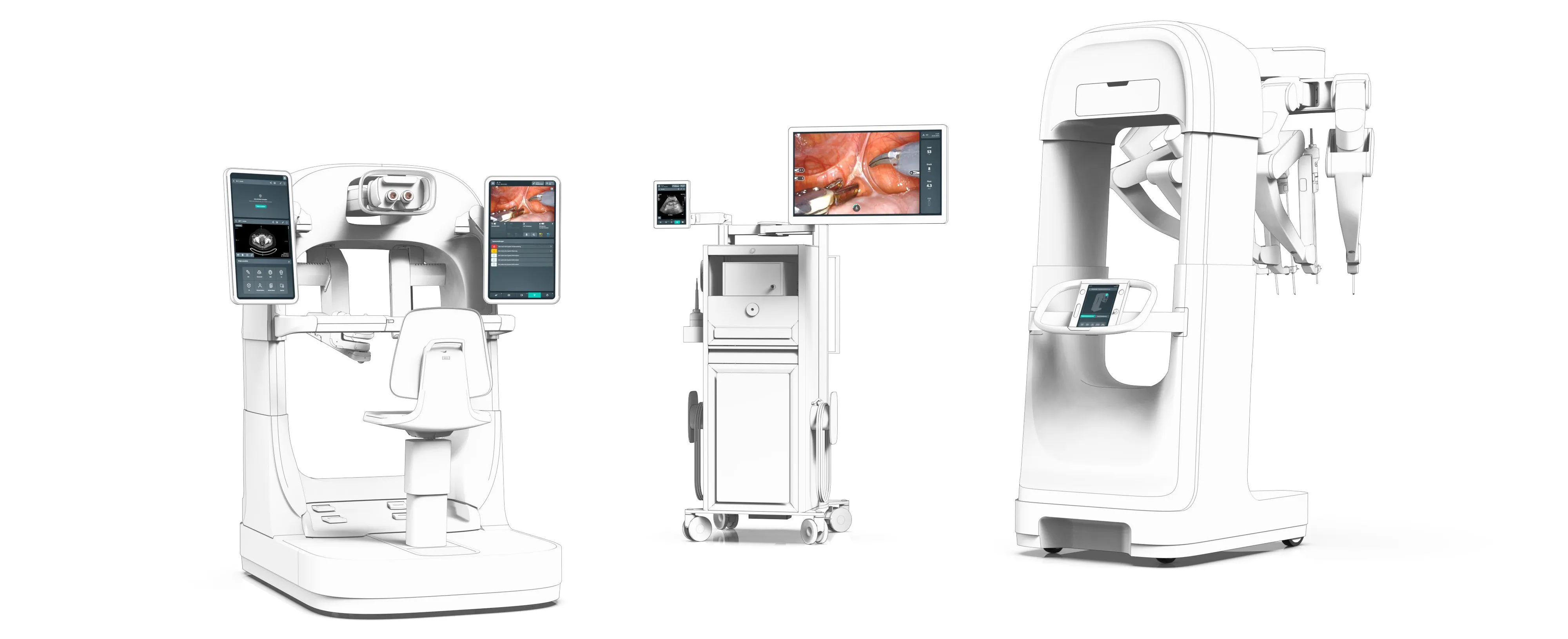
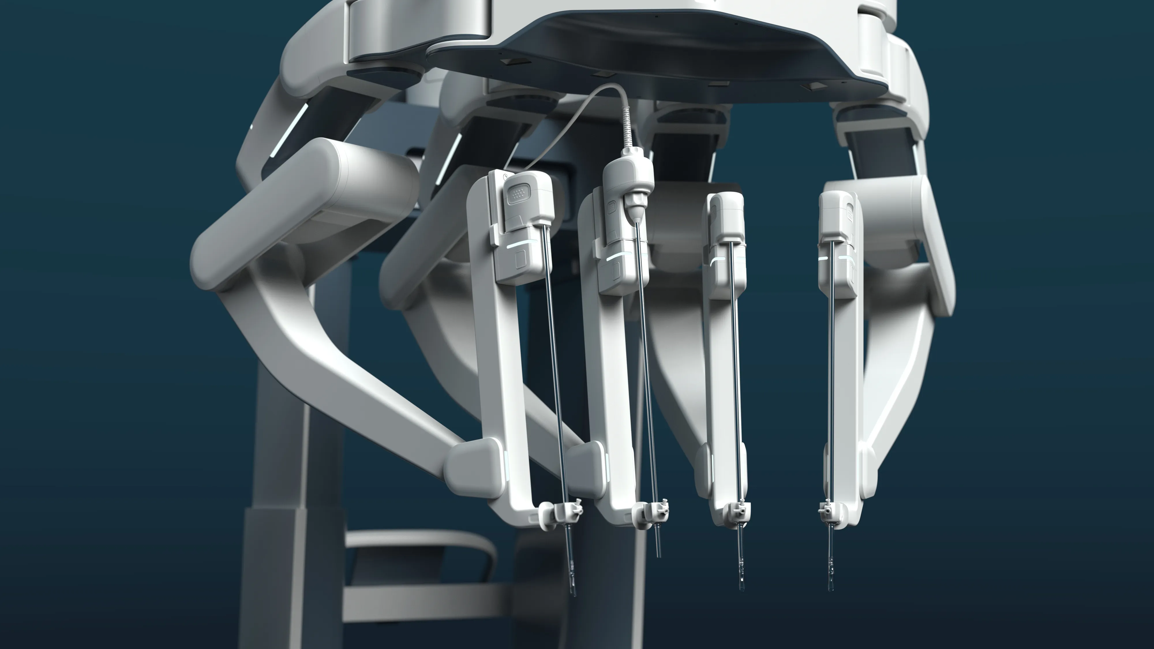
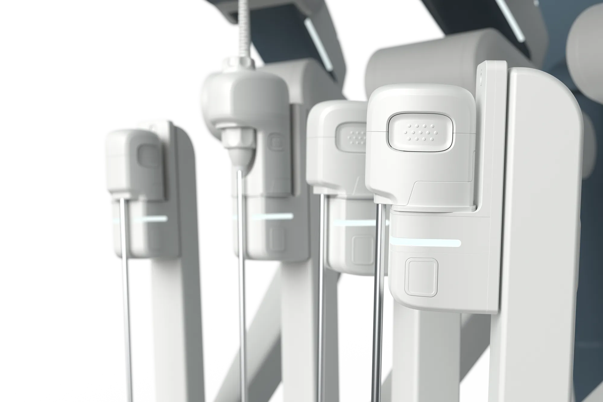
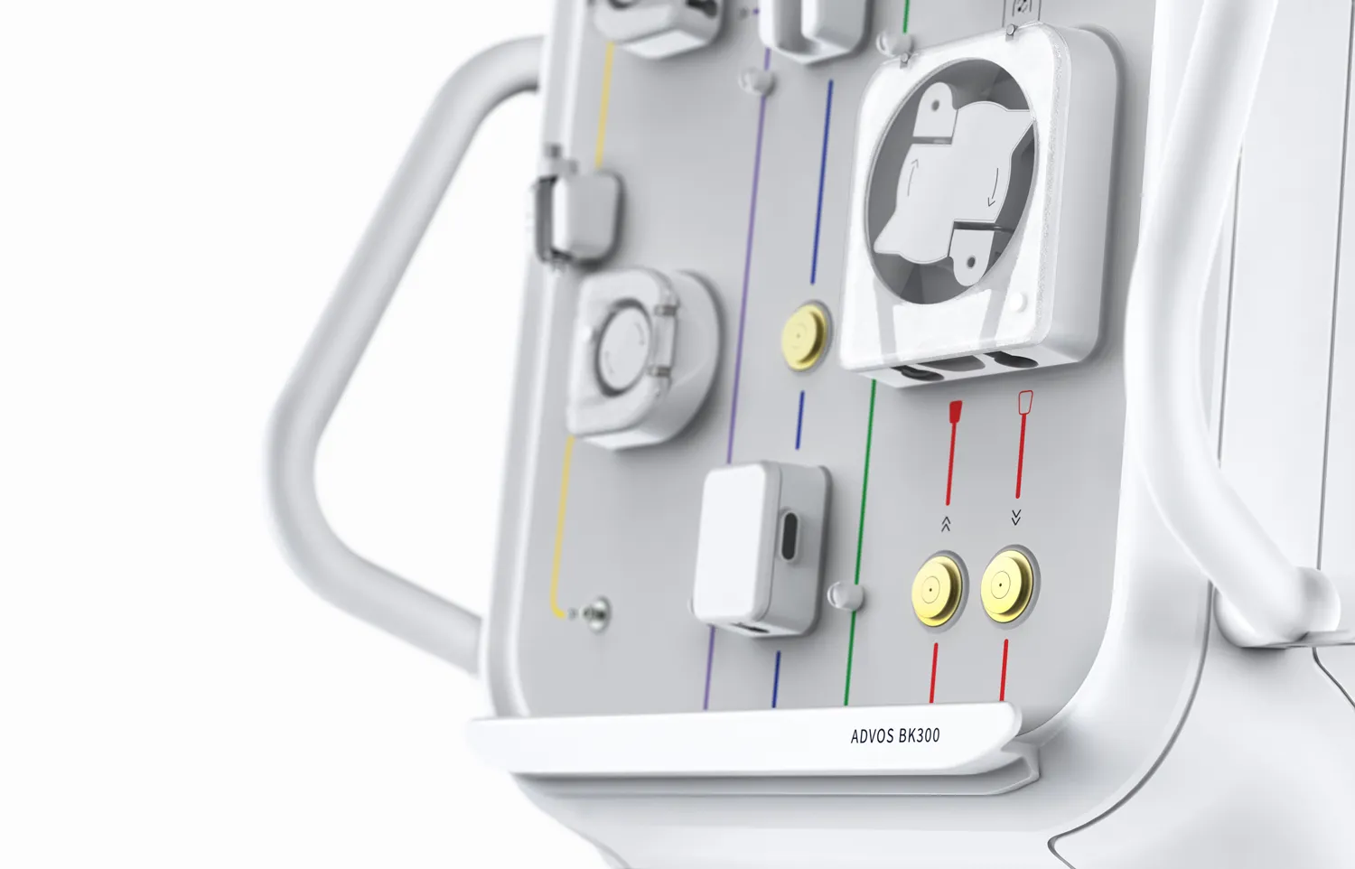
The integration of the various system components was a key element of this project. The open device portal design allowed for an improved overview in the OR, while the consistent Superellipse design language ensured recognizability and intuitive use.
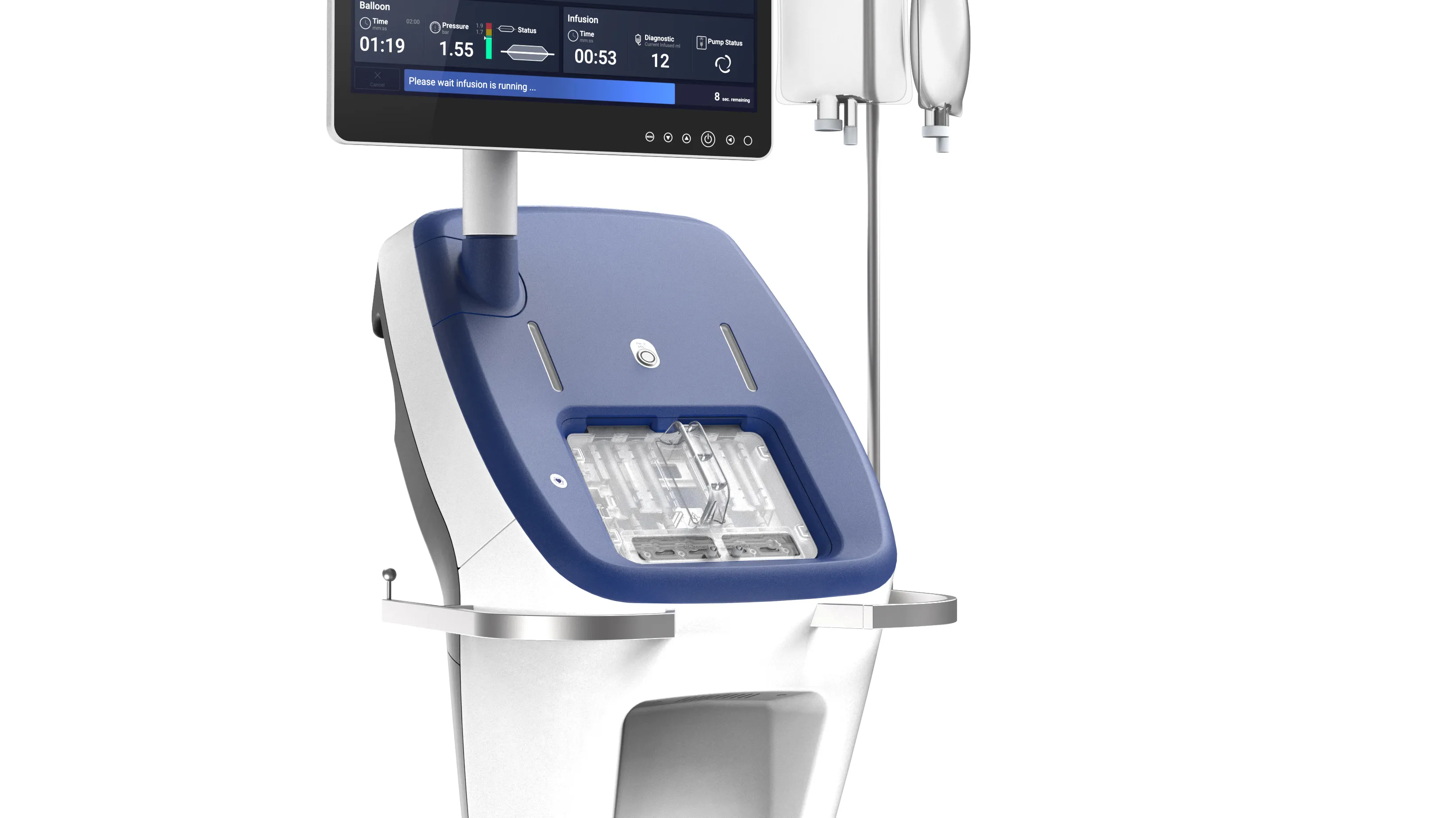
The interface had to integrate a robotic system with a total of six screens in different locations. The biggest challenge was to manage the complexity of the interface and ensure consistent and synchronized interaction across the different screen sizes and functions. Our focus was on optimal communication between the surgeon and the OR team as well as the customizability of the user interface. Other key objectives were the rapid acquisition of status displays and feedback without distraction and improved ergonomics for surgeons and the surgical team.
Design creates order and safety
The design of the telemanipulator went through numerous iterations, continuously incorporating feedback from surgeons and other stakeholders. Interdisciplinary workshops and regular reviews ensured that the design met the highest standards and was continuously improved. The innovative design language supported technological development and drove innovation in the field of robotic surgery. The flexible and scalable architecture of the system allows future technological advances to be seamlessly integrated and further increase the benefits for patients.
Ask the user!
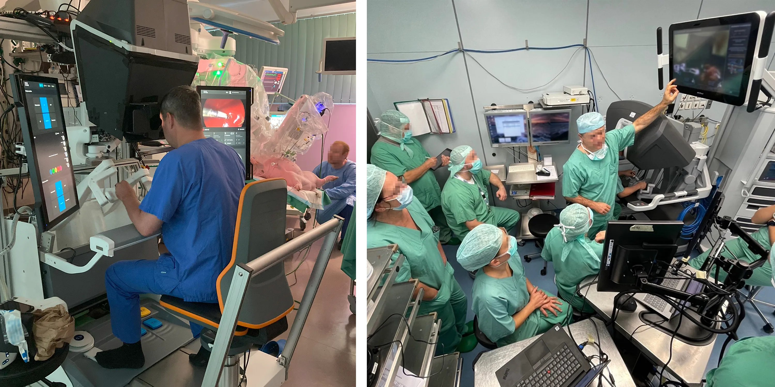
Our design process began with intensive user research. By observing robot-assisted operations, we gained a deep understanding of the workflows and tasks of the surgeons and the OR team. Interviews and observations helped us to identify specific requirements and challenges. Based on these findings, we created detailed workflows and use scenarios that served as the basis for the design of the user interface.
Build and test and start all over again...
Based on the knowledge gained, we developed the first prototypes, which we checked in usability tests and improved iteratively. The graphical user interface was designed in line with the brand and adapted to the formal language of the product design. By working closely with software developers, usability experts and medical specialists, we were able to create a user-centered interface.
Efficient workflows and improved ergonomics
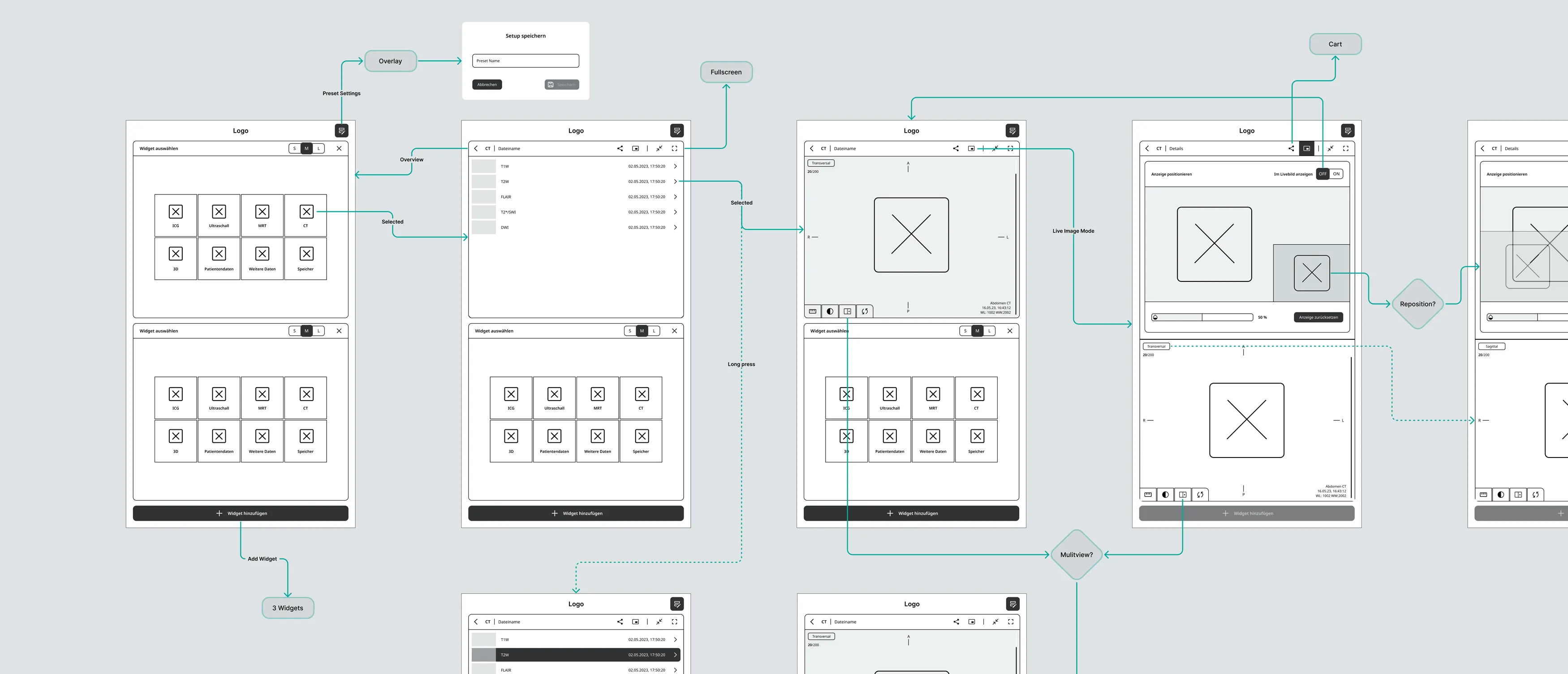
With a clear information architecture, we structured the content and functions of the interface to ensure intuitive and efficient navigation. The concept included initial drafts and ideas, which were visualized in wireframes and click prototypes. These prototypes enabled us to obtain feedback at an early stage and test the usability of the interface.
The design of the graphical user interface (GUI) was based on the formal language of the product design. Throughout the entire process, we worked closely with software development, usability experts, product owners and managers. Regular exchanges and collegial collaboration ensured that all of the client's requirements were taken into account. Through efficient development in design sprints, we were able to react quickly to feedback and continuously improve the interface.
What was the WILDDESIGN part?
- Interaction & navigation concept
- Workflow analysis
- Use scenarios
- Wireframes & prototyping
- UI design vision
- Conception and design of the graphical user interface (GUI)
- Usability Evaluation
- User-centered UI development

"The collaboration with our customer was a prime example of interdisciplinary cooperation and joint efforts to find the best solution. Various external partners and technical teams worked together seamlessly to develop a product that meets the highest demands in robotic surgery. The constructive exchange and commitment of everyone involved made it possible to find and implement innovative solutions. This project shows that outstanding results are achieved when expertise from different areas is combined."
Your contact person for the project
Anna-Lena Gölz
Head of Usability Engineering
+49-(0)89-780-196-50
annalena.goelz@wilddesign.de

.webp)
